
We’d like your assistance in selecting our choice of logo. Please email Graham (the designer) or Phil with your favourite one or two designs before the AGM using the reference numbers above the design. Alternatively post a comment below. We’ll then aim to finalise the choice at the AGM.
LOGO 1
![]()
LOGO 2
![]()
LOGO 3
![]()
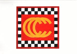
LOGO 4
![]()
LOGO 5
![]()
LOGO 6
![]()
LOGO 7

LOGO 8
LOGO 9

LOGO 10

LOGO 11

LOGO 12

LOGO 13
![]()
LOGO 14
![]()
Logo 9 is my vote.
I vote logo 9 too!
My vote for Logo 10
I too like Logo 9, and also 7 and 4. However, I think that the background inside the inner circle on each of these should be a plain colour rather than chequered. This would highlight the central motif.
Would suggest a logo that uses black/ white/grey to avoid colour printing but depends how the logo is going to be used? For this reason I would go for logo 4 with the Center circle being white or grey so the letters stand out.